> ## Documentation Index
> Fetch the complete documentation index at: https://docs.phantom.com/llms.txt
> Use this file to discover all available pages before exploring further.
# Phantom React SDK
> Integrate Phantom wallets into React web apps with hooks for multi-chain transaction support.
The Phantom Connect React SDK provides React hooks for connecting to existing Phantom user wallets in your React apps with native transaction support across multiple blockchains.
### Quick start
Generate a new Solana project using the **Phantom Embedded React Starter** template.
```bash theme={null}
npx -y create-solana-dapp@latest -t solana-foundation/templates/community/phantom-embedded-react
```
```bash theme={null}
pnpm create solana-dapp@latest -t solana-foundation/templates/community/phantom-embedded-react
```
```bash theme={null}
yarn create solana-dapp -t solana-foundation/templates/community/phantom-embedded-react
```
```bash theme={null}
bun create solana-dapp@latest -t solana-foundation/templates/community/phantom-embedded-react
```
Run the command above in your terminal to get started.
[View template on Solana Templates →](https://solana.com/developers/templates/phantom-embedded-react)
***
## Features
* Built for React: Provides React hooks (`usePhantom`, `useModal`) and a provider component for app-level configuration.
* Multi-chain support: Solana and Ethereum with dedicated hooks.
* Connection modal: Built-in, customizable modal for connecting users to Phantom.
* Flexible authentication providers: OAuth (Google, Apple) and the Phantom browser extension.
* User wallet integration: Connects to existing Phantom user wallets using Phantom Connect.
* TypeScript support: Fully typed API surface.
## Security
The Phantom Connect React SDK connects to existing Phantom user wallets, ensuring:
* Users control their own wallets and private keys.
* Integration with Phantom's secure wallet infrastructure.
* No private key handling in your application.
* User maintains full control of their assets.
## Prerequisites
**Phantom Portal is not accepting new applications at this time.** New sign-ups for Phantom Connect SDK access and new app submissions to the Phantom app directory are paused. Existing Portal apps and App IDs are not affected.
* Use an existing app: Sign in to the [Phantom Portal](https://phantom.com/portal/) and select your app.
* Obtain your App ID:
* In Phantom Portal, expand your app in the left navigation, then select **Set Up**.
* Your App ID appears at the top of the page.
* Allowlist your domains and redirect URLs: Add your app's domains and redirect URLs in the Phantom Portal to enable wallet connections.
## Authentication configuration
When using OAuth providers (google, apple), you'll need to configure authentication options:
```tsx theme={null}
authOptions: {
redirectUrl: "https://yourapp.com/auth/callback", // Your callback page
}
```
**Important notes about `redirectUrl`:**
* Must be an existing page/route in your application
* Must be whitelisted in your Phantom Portal app configuration
* This is where users will be redirected after completing OAuth authentication
* Required for google and apple providers
* Not required for injected provider
## Installation
```bash theme={null}
npm install @phantom/react-sdk
```
## Dependencies
Install additional dependencies based on the networks you want to support:
| Network support | Required dependencies |
| - | - |
| Solana | `@solana/web3.js` OR `@solana/kit` |
| Ethereum/EVM | `viem` |
Example for Solana and Ethereum support:
```bash theme={null}
npm install @phantom/react-sdk @solana/web3.js viem
```
## Quick start
```tsx theme={null}
import { PhantomProvider, useModal, darkTheme, usePhantom } from "@phantom/react-sdk";
import { AddressType } from "@phantom/browser-sdk";
function App() {
return (
);
}
function WalletComponent() {
const { open, close, isOpened } = useModal();
const { isConnected, user } = usePhantom();
if (isConnected) {
return (
Connected
);
}
return ;
}
```
## Connection Modal
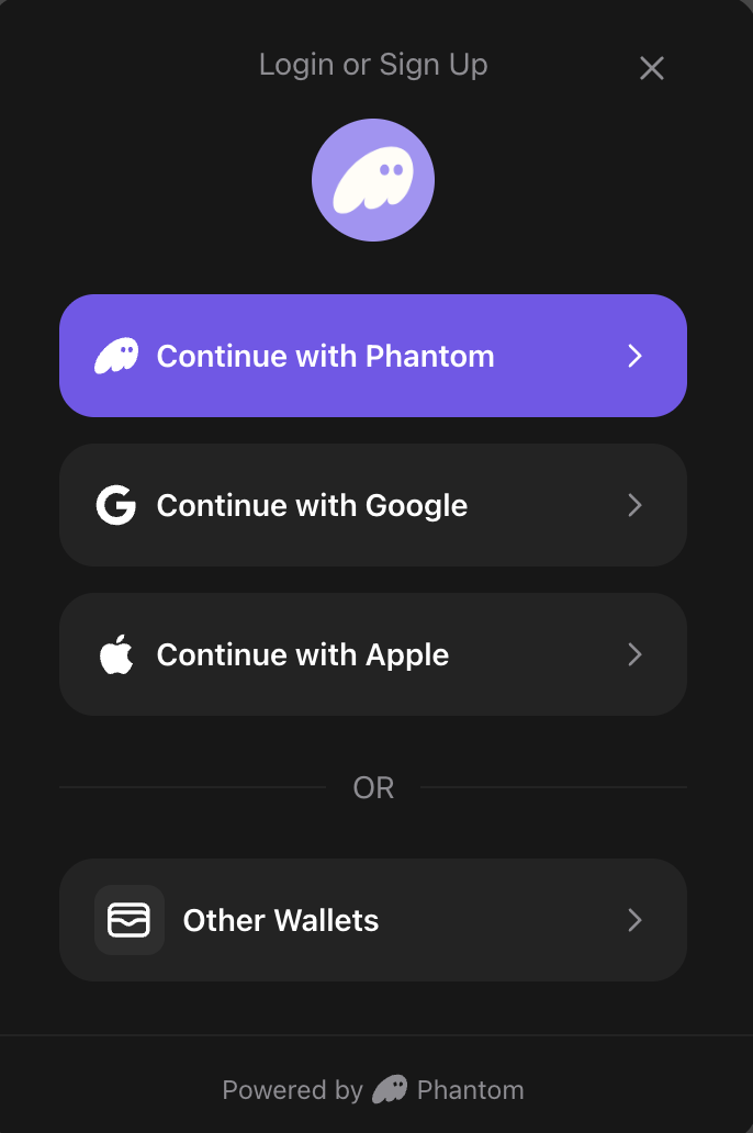
The SDK includes a built-in connection modal UI that provides a user-friendly interface for connecting to Phantom. The modal supports multiple connection methods (Google, Apple, browser extension) and handles all connection logic automatically.
### Using the Modal with useModal Hook
To use the modal, pass a `theme` prop to `PhantomProvider` and use the `useModal()` hook to control visibility:
```tsx theme={null}
import { PhantomProvider, useModal, darkTheme, usePhantom } from "@phantom/react-sdk";
import { AddressType } from "@phantom/browser-sdk";
function App() {
return (
);
}
function WalletComponent() {
const { open, close, isOpened } = useModal();
const { isConnected } = usePhantom();
if (isConnected) {
return (
Connected
);
}
return ;
}
```
**Modal features:**
* **Multiple auth providers**: Google, Apple, browser extension
* **Automatic provider detection**: Shows browser extension option when Phantom is installed
* **Error handling**: Clear error messages displayed in the modal
* **Loading states**: Visual feedback during connection attempts
* **Responsive design**: Optimized for both mobile and desktop
### ConnectButton Component
A ready-to-use button component that handles the complete connection flow:
```tsx theme={null}
import { ConnectButton, AddressType } from "@phantom/react-sdk";
function Header() {
return (
{/* Default: Shows first available address */}
{/* Show specific address type */}
{/* Full width button */}
);
}
```
ConnectButton features:
* When disconnected: Opens connection modal with auth provider options
* When connected: Displays truncated address and opens wallet management modal
* Uses theme styling for consistent appearance
### ConnectBox component
An inline embedded component that displays the connection UI directly in your page layout (without a modal backdrop). Perfect for auth callback pages or when you want a more integrated connection experience. The component automatically handles all connection states including loading, error, and success during the auth callback flow.
```tsx theme={null}
import { ConnectBox } from "@phantom/react-sdk";
function AuthCallbackPage() {
return (
Connecting to Phantom...
);
}
```
Props:
| Property | Type | Default | Description |
| - | - | - | - |
| `maxWidth` | `string \| number` | `"350px"` | Maximum width of the box |
| `transparent` | `boolean` | `false` | Removes background, border, and shadow for a transparent appearance |
| `appIcon` | `string` | — | URL to your app icon (optional, can also be set via `PhantomProvider`) |
| `appName` | `string` | — | Your app name (optional, can also be set via `PhantomProvider`) |
**Usage Examples:**
```tsx theme={null}
import { ConnectBox } from "@phantom/react-sdk";
// Default usage
// Custom width
// Transparent (no background/border)
// Custom width with transparent
```
**ConnectBox Features:**
* **Inline embedded**: Renders directly in page flow (not as a floating modal)
* **Auto state management**: Automatically shows connection/login UI when disconnected, wallet info when connected
* **Auth callback support**: Handles loading and error states during OAuth callback flows
* **No close button**: Designed for embedded use cases where users shouldn't dismiss the UI
* **Theme-aware**: Uses your configured theme for consistent styling
**Use ConnectBox for auth callback pages**: When using OAuth providers (Google, Apple), users are redirected to your callback URL after authentication. Place `ConnectBox` on this page to automatically handle the auth flow completion with proper loading and error states.
## Theming
The SDK includes pre-built themes and supports full customization to match your app's design.
### Pre-built themes
Use the included `darkTheme` or `lightTheme`:
```tsx theme={null}
import { PhantomProvider, darkTheme, lightTheme } from "@phantom/react-sdk";
// Dark theme
// Light theme
```
### Custom themes
Create a custom theme object to fully control the modal's appearance:
```tsx theme={null}
const customTheme = {
background: "#1a1a1a", // Background color for modal
text: "#ffffff", // Primary text color
secondary: "#98979C", // Secondary color for text, borders, dividers
brand: "#ab9ff2", // Brand/primary action color
error: "#ff4444", // Error state color
success: "#00ff00", // Success state color
borderRadius: "16px", // Border radius for buttons and modal
overlay: "rgba(0, 0, 0, 0.8)", // Overlay background color (with opacity)
};
```
| Property | Description | Example |
| - | - | - |
| `background` | Modal background color | `"#1a1a1a"` |
| `text` | Primary text color | `"#ffffff"` |
| `secondary` | Secondary text, borders, and dividers | `"#98979C"` |
| `brand` | Brand/primary action color | `"#ab9ff2"` |
| `error` | Error state color | `"#ff4444"` |
| `success` | Success state color | `"#00ff00"` |
| `borderRadius` | Border radius for buttons and modal | `"16px"` |
| `overlay` | Modal overlay background (supports opacity) | `"rgba(0, 0, 0, 0.8)"` |
The `secondary` color must be a hex color value (for example, `#98979C`) as it's used to derive auxiliary colors with opacity.
## Chain-Specific Hooks
The React SDK provides dedicated hooks for each blockchain:
### useSolana hook
```tsx theme={null}
import { useSolana } from "@phantom/react-sdk";
function SolanaOperations() {
const { solana, isAvailable } = useSolana();
// Check if Solana is available before using it
if (!isAvailable) {
return
);
}
```
### useEthereum hook
EVM support for Phantom Connect embedded wallets will go live later in 2026.
```tsx theme={null}
import { useEthereum } from "@phantom/react-sdk";
function EthereumOperations() {
const { ethereum, isAvailable } = useEthereum();
// Check if Ethereum is available before using it
if (!isAvailable) {
return
);
}
```
## Wallet Discovery Hook
### useDiscoveredWallets
Get discovered injected wallets with automatic loading and error states. Discovers wallets using Wallet Standard (Solana) and EIP-6963 (Ethereum) standards.
```tsx theme={null}
import { useDiscoveredWallets } from "@phantom/react-sdk";
function WalletSelector() {
const { wallets, isLoading, error, refetch } = useDiscoveredWallets();
if (isLoading) {
return
Discovering wallets...
;
}
if (error) {
return
Error discovering wallets: {error.message}
;
}
return (
Available Wallets
{wallets.map((wallet) => (
{wallet.name}
))}
);
}
```
Returns:
| Property | Type | Description |
| - | - | - |
| `wallets` | `InjectedWalletInfo[]` | Array of discovered wallet information |
| `isLoading` | `boolean` | `true` while discovery is in progress |
| `error` | `Error \| null` | Error object if discovery fails |
| `refetch` | `() => Promise` | Function to manually refresh the wallet list |
## SDK Initialization
The SDK provides an `isLoading` state to track when initialization and autoconnect are in progress:
```tsx theme={null}
import { useConnect, usePhantom } from "@phantom/react-sdk";
function App() {
const { isLoading } = usePhantom();
const { connect } = useConnect();
// Show loading state while SDK initializes
if (isLoading) {
return (
Initializing Phantom SDK...
Please wait...
);
}
// SDK is ready
return (
Welcome!
);
}
```
## Debug Configuration
Configure debug logging by passing a `debugConfig` prop to `PhantomProvider`:
```tsx theme={null}
import { PhantomProvider, DebugLevel } from "@phantom/react-sdk";
function App() {
const [debugMessages, setDebugMessages] = useState([]);
const debugConfig = {
enabled: true,
level: DebugLevel.INFO,
callback: (message) => {
setDebugMessages((prev) => [...prev, message]);
},
};
return (
);
}
```
Debug configuration properties:
| Property | Type | Description |
| - | - | - |
| `enabled` | `boolean` | Enable debug logging |
| `level` | `DebugLevel` | Debug level (ERROR, WARN, INFO, DEBUG) |
| `callback` | `(message: DebugMessage) => void` | Custom debug message handler |
## Available hooks
| Hook | Purpose | Returns |
| - | - | - |
| `useModal` | Control the connection modal | `{ open, close, isOpened }` |
| `usePhantom` | Access wallet/user state | `{ isConnected, isLoading, user, wallet }` |
| `useConnect` | Connect to wallet | `{ connect, isConnecting, isLoading, error }` |
| `useAccounts` | Get wallet addresses | `WalletAddress[]` or `null` |
| `useIsExtensionInstalled` | Check extension status | `{ isLoading, isInstalled }` |
| `useDisconnect` | Disconnect from wallet | `{ disconnect, isDisconnecting }` |
| `useAutoConfirm` | Auto-confirm management (injected only) | `{ enable, disable, status, supportedChains, ... }` |
| `useDiscoveredWallets` | Get discovered injected wallets | `{ wallets, isLoading, error, refetch }` |
| `useSolana` | Solana chain operations | `{ solana, isAvailable }` |
| `useEthereum` | Ethereum chain operations | `{ ethereum, isAvailable }` |
| `useTheme` | Access current theme | `PhantomTheme` |
## What you can do
Learn how to connect to Phantom user wallets with React hooks
Implement message signing for authentication and verification
Handle transaction signing and broadcasting across blockchains
## Starter kits and examples
Get started quickly with production-ready React templates:
Full-featured React example with wallet connection, signing, and transactions
Complete Next.js integration with Phantom React SDK
Use Phantom SDK alongside Wagmi for enhanced Ethereum support
Drop-in connect modal example showing the full sign-in flow
Browse all example applications on GitHub
## Additional resources
Compare all Phantom SDKs and choose the right one
Learn about authentication flows and user experience
Implement custom JWT-based authentication
 ```tsx theme={null}
import { ConnectBox } from "@phantom/react-sdk";
function AuthCallbackPage() {
return (
```tsx theme={null}
import { ConnectBox } from "@phantom/react-sdk";
function AuthCallbackPage() {
return (